Analyzing COVID19 in Sri Lanka with Python
In under 10 minutes
In this tutorial, we will build some graphs that will give a data-driven description of Sri Lanka’s COVID19 situation. End-to-end, it should take you less than 10 minutes.
The data is from two sources:
- The COVID-19 Data Repository by the Center for Systems Science and Engineering (CSSE) at Johns Hopkins University, which we can access at https://github.com/CSSEGISandData/COVID-19 and in aggregate at https://pomber.github.io/covid19/timeseries.json.
- The Health Promotion Bureau of Sri Lanka, which we can access at https://www.hpb.health.gov.lk/api/get-current-statistical.
Part 1: Getting the data
You can either pull the above data yourself. Or we can use my python library, covid19-nuuuwan, which enables convenient data access. To install run,
pip install covid19-nuuuwan[You can find the complete source code on GitHub. Feel free to fork this code, or report issues.]
To access the complete Johns Hopkins University data set (which contains up-to-date time series of confirmed cases recoveries and deaths for 189 countries from Afghanistan to Zimbabwe),
>>> from covid19 import covid_data
>>> jhu_data = covid_data.load_jhu_data()
>>> len(jhu_data.values())
189>>> country_ids = list(jhu_data.keys())
>>> country_ids[0], country_ids[-1]('AF', 'ZW')
Each country entry looks like,
>>> jhu_data['LK']{
 'country_name': 'Sri Lanka',
 'country_alpha_2': 'LK',
 'country_alpha_3': 'LKA',
 'population': 21803000,
 'timeseries': [
  {
   'date': '2020-01-22 00:00:00',
   'unixtime': 1579631400.0,
   'cum_confirmed': 0,
   'cum_deaths': 0,
   'cum_recovered': 0,
   'active': 0,
   'new_confirmed': 0,
   'new_deaths': 0,
   'new_recovered': 0,
   'cum_vaccinations': 0,
   'cum_people_vaccinated': 0,
   'cum_people_fully_vaccinated': 0,
},
  ...
  ...
  ...
  {
   'date': '2021-06-09 00:00:00',
   'unixtime': 1623177000.0,
   'cum_confirmed': 213396,
   'cum_deaths': 1910,
   'cum_recovered': 180427,
   'active': 31059,
   'new_confirmed': 2735,
   'new_deaths': 66,
   'new_recovered': 2168,
   'cum_vaccinations': 2450965,
   'cum_people_vaccinated': 2089320,
   'cum_people_fully_vaccinated': 361645,
  }
 ]
}
Similarly, the Health Promotion Bureau contains a time-series of PCR tests, information about hospitals and various cumulative statistics.
{
 "success":true,
 "message":"Success",
 "data":{
  "update_date_time":"2021-06-11 11:33:36",
  "local_new_cases":2738,
  "local_total_cases":216134,
  "local_total_number_of_individuals_in_hospitals":31986,
  "local_deaths":1910,
  "local_new_deaths":67,
  "local_recovered":182238,
  "local_active_cases":31986,
  "global_new_cases":421019,
  "global_total_cases":175332051,
  "global_deaths":3780265,
  "global_new_deaths":14097,
  "global_recovered":159186733,
  "total_pcr_testing_count":3690770,
  "daily_pcr_testing_data":[
   {
    "date":"2020-02-18",
    "count":"1"
   },
...
Part 2: Analyzing the data
Now that we have the data, you can use your favourite analytics library to dig deeper into it. In this tutorial, we’ll build some graphs with MatPlotLib.
[You can find the source code for these examples on GitHub.]
Example 1: Deaths per 100,000 people
We can access the COVID19 time-series for Sri Lanka with,
jhu_data = covid_data.load_jhu_data()
country_data = jhu_data['LK']
timeseries = country_data['timeseries']
This data also includes the population for each country, which can be accessed with,
pop = country_data['population']To plot a line plot with MatPlotLib,
    x = list(map(
        lambda d: datetime.datetime.fromtimestamp(d['unixtime']),
        timeseries,
    ))
    y = list(map(
        lambda d: 100_000 * d['cum_deaths'] / pop,
        timeseries,
    ))
    plt.plot(x, y, color=country_meta_data['color'])
After some cosmetic improvements (see example code for details),

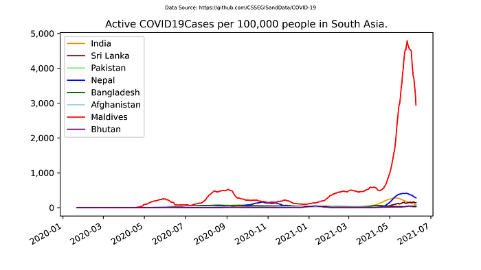
Example 1a: Active Cases per 100,000 people
Similarly, we can plot Active Cases:
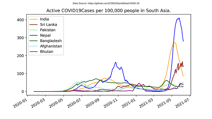
Example 1b: Active Cases per 100,000 people — minus the Maldives
(Since Maldives is an outlier)
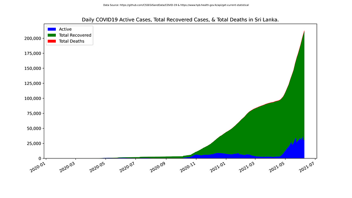
Example 2: Daily COVID19 Active Cases, Total Recovered Cases and Total Deaths in Sri Lanka
With the same JHU dataset, let’s focus on Sri Lanka. We can plot a stack plot of Active Cases, Total Recovered Cases and Total Deaths as follows:
country_data = covid_data.load_jhu_data()['LK']
timeseries = country_data['timeseries']x = list(map(
    lambda d: datetime.datetime.fromtimestamp(d['unixtime']),
    timeseries,
))
y1 = list(map(
    lambda d: d['active'],
    timeseries,
))
y2 = list(map(
    lambda d: d['cum_recovered'],
    timeseries,
))
y3 = list(map(
    lambda d: d['cum_deaths'],
    timeseries,
))plt.stackplot(x, y1, y2, y3, colors=['blue', 'green', 'red'])
We get,
Example 2a: Total COVID19 Deaths in Sri Lanka
If we remove y1 and y2 from above (because the red stack can, thankfully for now, hardly be seen),

Example 2b: Daily COVID19 Active Cases, Total Recovered Cases and Total Deaths in China
We can plot the above charts for any country we like by simply modifying,
country_data = covid_data.load_jhu_data()['CN']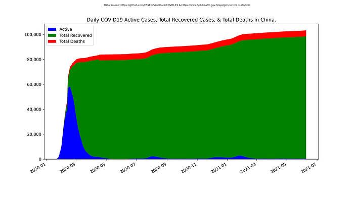
Example 2b: Daily COVID19 Active Cases, Total Recovered Cases and Total Deaths in Israel
country_data = covid_data.load_jhu_data()['IL']
Note, the effect of vaccination.
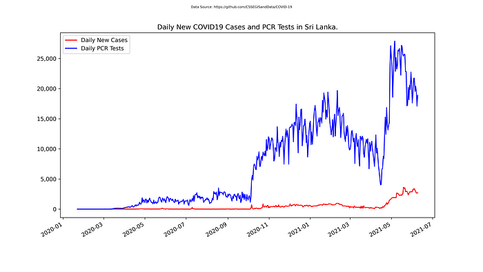
Example 3: Daily New COVID19 Cases and PCR Tests in Sri Lanka
In addition to the JHU data for Sri Lanka, the HBP dataset also proviceds PCR Tests. The combined time-series for Sri Lanka can be accessed as follows:
from covid19 import lk_data
timeseries = lk_data.get_timeseries()
Important: lk_data, not covid_data
Plotting with MatPlotLib gives us,
Example 4: Daily New COVID19 Cases per PCR Tests in Sri Lanka
Finally, let’s plot the ratio of the two plots above. In addition to the raw Cases per Test, we also plot the 14 day moving average, for a smoother analysis.

Example 5: % People vaccinated in South Asia
    x = list(map(
        lambda d: datetime.datetime.fromtimestamp(d['unixtime']),
        timeseries,
    ))
    y = list(map(
        lambda d: d['cum_people_vaccinated'] / population,
        timeseries,
    ))
    plt.plot(x, y, color=country_meta_data['color'])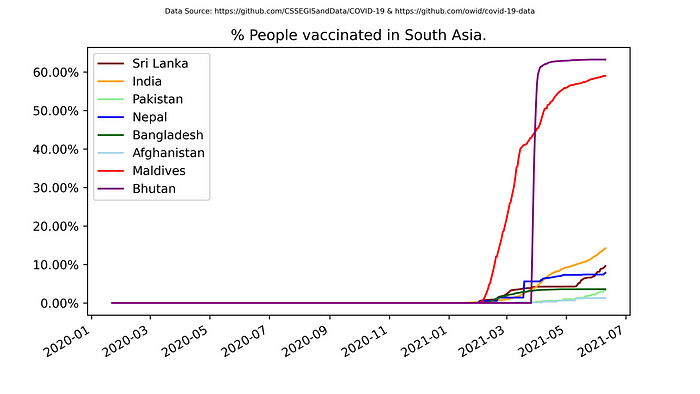
Example 5a: % People vaccinated in South Asia — without the Maldives and Bhutan

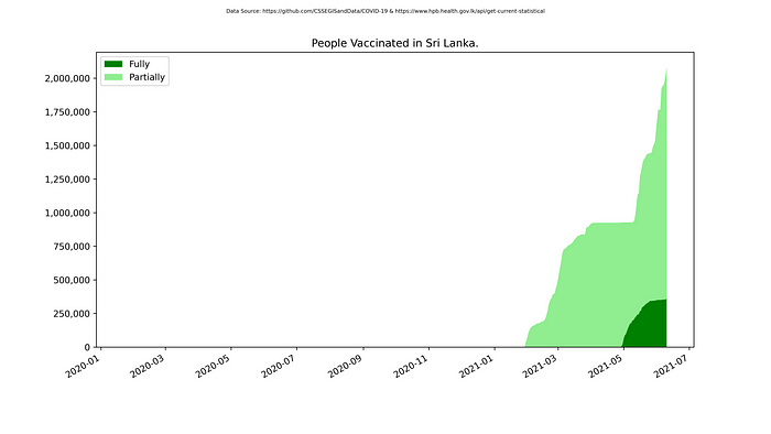
Example 6: Total People Vaccinated in Sri Lanka
x = list(map(
    lambda d: datetime.datetime.fromtimestamp(d['unixtime']),
    timeseries,
))
y1 = list(map(
    lambda d: d['cum_people_fully_vaccinated'],
    timeseries,
))
y2 = list(map(
    lambda d: d['cum_people_vaccinated'] - d['cum_people_fully_vaccinated'],
    timeseries,
))plt.stackplot(x, y1, y2, colors=['green', 'lightgreen'])
…
If you enjoyed this article, you might also like,
